|
|
|
Restoration Print Culture aims to make texts from the Restoration (1660-1714) available on the web in a format that conveys the flavor of the original documents, yet remain readable, searchable, and linked up with contextual information. The public version of the site currently contains a number of popular ballads and other broadsheets on the topics of sexual morality and politics, along with a few historical documents. It combines graphics (mainly woodcuts from broadsides, but also some facsimiles) and music (midi files as well as sheet music of ballads) with poetry and prose typeset to approximate the look of the original documents. There are even a few dance steps.
My editorial policy is to aim for a visual approximation of the original document,
making allowances for the new medium. This means for instance that I will use
electronic equivalents of Restoration fonts, but I will generally not reproduce
page divisions. I will reproduce spelling mistakes, but I will generally not attempt
to reproduce the page layout: monitor sizes vary and it is impossible to test
all browsers. Double and quadruple colums are generally rendered as a single column;
there is no reason to cram a lot of text into a small space. In most cases a facsimile
of the text is available from the light blue information panel, which is usually
placed at the end of the text or (in the case of long texts) after the titlepage.
Many of the texts in CogWeb's Restoration Print Culture have been typeset with a modern reconstruction of a sixteenth-century blackletter font and a late seventeenth-century Baroque Oldstyle with an italic complement. Jeff Lee has done an wonderful job recreating these from scanned documents. As he explains:
The "JSL Ancient" and "JSL Ancient Italic" fonts are based upon two nearly identical typefaces of seventeenth-century English printers. The first source used was A compendious view of the late tumults & troubles in this kingdom by way of annals for seven years, by James Wright, printed by Edward Jones in 1685; the second was Ars Pictoria, or an Academy treating of Drawing, Painting, Limning and Etching, by Alexander Browne, printed by J. Redmayne in 1668.
A conflict prevented a few characters in version 1.0 of the JSL fonts -- notably the ligatures "ct" and "ff" -- from displaying correctly in Internet Explorer. Jeff remapped some of the characters in version 2.0 in January 2000. The files on this site were updated to the new code mapping on 9 May 2000, so if you installed the first version of the JSL fonts, you will need to update them now.
The new version can be embedded, however, and while I'm looking for better browser-independent methods, I have embedded all three JSL fonts using Microsoft's WEFT, which allows you to view the blackletter font without installing it on your computer. This method works only with Internet Explorer; as of August 2000, it should also work in MacIE. If you use Internet Explorer to browse the web, you won't need to download these fonts.
If you use another browser, such as Netscape or Opera, you will need to download the fonts to view the pages as they are intended. The new version of the JSL fonts displays correctly in recent versions of Netscape (at least from 4), Opera (from 3.6), and Internet Explorer (at least from 4) running on Windows 95/98. Earlier and other browsers have not been tested. It was made for OS/2 and also works on Macs, though I don't have installation instructions. Netscape and Opera can be downloaded for free at home.netscape.com and www.opera.com.
The fonts you need are called JSL fonts Blackletter, Ancient, and Ancient Italic, available for free from Jeff Lee's computer typography.
On a Mac, download the fonts, open the Fonts Book application, and drag the fonts into the Font Book. To get correct ligatures, you may also need to set your browser to default to the "Western (MacRoman)" character encoding (thanks to John S.L. Singleton).
Italics fonts were quite variable at the time and the one I have is not always a good match; there were also several blackletter and regular fonts in use.
A number of the pages use style definitions, which form part of the Cascading Style Sheets specification from the W3 consortium. Since they are somewhat variously and at times erratically implemented by the various browsers, the effects won't be uniform. However, they have been tested in Netscape 4.x, Opera 3.6, and IE5. Please note that JavaScript must be enabled for the CSS effects to work.
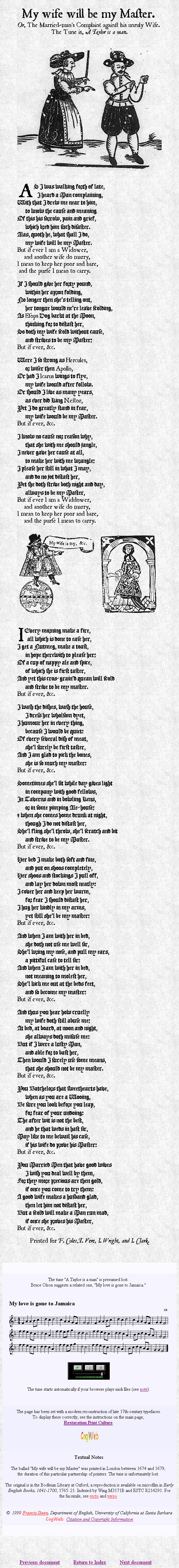
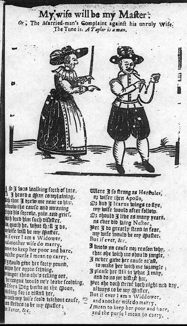
To see an example and to test your browser, check out "My wife will be my Master. Or, The Married-man's Complaint against his unruly Wife." It should look roughly like this picture. For comparison, here is a rather poor reproduction of the original.
.
Some of the ballad pages are designed to play the appropriate tune automatically when loaded, with an embedded console. The tunes are Musical Instruments Digital Interface (midi) files, a highly compact digital encoding format. It represents notes rather than sounds and uses your sound card as a synthesizer. To hear the tunes on the web, your browser must have a plug-in for playing midi files. The recommended procedure is to download the latest version of Netscape, which includes a hassle-free plugin, but there are dozens of solutions to this requirement. If you use Opera (free trial version from www.opera.com), you probably need to download a separate plug-in for the music (use the Netscape-compatible version). Internet Explorer also comes with a built-in midi player. Please note that Java must be enabled for the midi files to play.
The midi files are generated from collections of tunes in the abc format, an ascii notation developed to fascilitate the storage and exchange of tunes on computers. The abc files are also used to generate the sheet music images. These files are transcriptions from historical collections. They are identified with reference to W. Bruce Olson's admirable Index of Broadside Ballad Tunes (external), which derives from and adds to Claude M. Simpson's standard reference work, The British Broadside Ballad and Its Music (Simpson, 1966). The tunes are converted from the abc format provided by Olson to MIDI using the abcmidi program written by Seymour Shlien.
Restoration music was printed from engraved plates, woodcuts, or set type; much was also copied by hand. During the hand press period, typesetting usually relied on a method of double impression. The staves were printed at one impression and the notes at another. Even as early as the 1520s, however, special fonts were created to print music using only one impression: each piece of type had a note as well as a piece of the stave (Gaskell, 1972: 138-39; thanks to Stephen Karian for this information). For the history of printed music, see also King, 1964. Simpson's main sources are printed sheet music from the period; for an example, see Playford's The Dancing Master from 1653 (external new window). Broadsides also sometimes included the music.
In some instances, the original tune is considered lost, although it may have survived under another name. Ballad broadsides frequently list alternative melodies and in most cases at least one of them is extant. If necessary, one can follow a chain of such alternatives to arrive at an extant tune -- in that case, one that may not originally have been associated with the ballad, but which has a compatible structure.
In the case of A new Ballad of the Protestant Joyner and My wife will be my Master, I have duplicated some lines of music to allow for an extra line of text or a refrain, a practice that appears to have been common at the time (cf. for instance Simpson's discussion of "In London Town.")
The popular music of the period adds a delightful and valuable dimension to the text and appearance of the ballads. The ballad tune frequently modulates the meaning of the text in subtle but effective ways, highlighting repetitions, emphasizing and dramatizing certain phrases, marking turning points or unexpected continuities in the argument. The result is to convey a more specified but subtle intentional relation to the material, such as serenity or gloating.
Sometimes the tunes convey a sense of the body in motion to the music,
and several of the ballad tunes were indeed also dances. A few links have
been included to the online
version of Playford's The Dancing Master (1653), which was reprinted
and expanded repeatedly during the Restoration; see for instance Murder
Out At Last and My Dog and I.
The illustrations are mostly woodcuts and the quality varies. I have often enhanced them by a few simple operations to remove blotches and grit, to lighten dark images, or very occasionally to fill in riddled lines. My aim has been to remove noise introduced by photocopying and to get somewhat closer to the original appearance. Facsimiles are generally available for comparison.
Woodcuts were often reused by a printer, so that a ballad may be illustrated with woodcuts originally designed for another publication. Some woodcuts, such as the man and woman sitting on a bed kissing (see Advice to the Young Gentlemen), are used as stock emblems for a certain situation. The result is that the illustrations are not always appropriate and inferences from them regarding the intended meaning should be made with caution. On the other hand, if a new print is made for a ballad, this becomes all the more significant.
Title pages have a special significance in that they often were posted as advertisements (but see the next section for a caveat). This in part explains why they typically are so full of information, presenting in effect an abstract. Large type was used to attract attention, and the bookseller's name and location is mentioned so that interested customers will know where to purchase the book. (See for instance Swift's "Dedication: To Prince Posterity" in A Tale of a Tub, where Swift refers to title pages posted in public; for further references see the note in the Guthkelch and Nichol Smith edition of A Tale of a Tub, page 34.)
The Collectors
The Ames collection in the British Library (Joseph Ames, 1689-1759) consists of several volumes elephant-folio with thousands of title-pages, flyers, advertisements, prospecti, etc. According to Patrick Spedding, the title pages that functioned as flyers differ slightly from the title pages published in the actual books: "It may be that simple in-press alterations were made to title-pages to make them more suitable as advertisements" (12 July 2000).
While Ames may simply have collected items as they were distributed, other collectors used more destructive methods. As Blades wrote of John Bagford (1650-1716) in The Enemies of Books,
It is a serious matter when Nature produces such a wicked biblioclast as John Bagford ... who in the beginning of the last century, went about the country, from library to library, tearing away title-pages from books of all sizes. These he sorted out into nationalities and towns, and so, with a lot of hand-bills, manuscript notes, and miscellaneous collections of all kinds, formed over a hundred folio volumes, now preserved in the British Museum. That they are of service as materials in compiling histories of printing cannot be denied, but the destruction of many rare books was the result, and more than counter-balanced any benefit bibliographers will ever receive from them... (1902 edition, p. 110).
For a list of ballad collections, see the Bibliography
(password required).
"The common book-trade designation of sizes was originally related to a sheet of handmade paper measuring 19 X 25 inches, which was the common size of the papermaking mold. When folded to 8 leaves, or 16 pages, and trimmed, each was 6 1/2 X 9 1/4 inches, approximately, and was the standard dimension of an 8vo. When folded to make 16 leaves, or 32 pages, it was a 16 mo."
Roberts, Matt T. and Don Etherington. Bookbinding and the Conservation of Books: A Dictionary of Descriptive Terminology. Keyword book sizes (external).In practice, a variety of basic sheet sizes were used for books, resulting in different leaf sizes. Independently of the size of the sheet, folio is the book size resulting from folding a sheet one time, giving two leaves half the size of the sheet. Further folding results in four, eight, and sixteen leaves, known by the terms quarto, octavo, and sextodecimo. The leaves were then trimmed, typically removing 1/8" at the margins.
Full single sheets, known as broadsheets, were often used for
royal proclamations and sometimes for ballads; the ESTC indicates
these by the designation 1o. Any single sheet publication, printed
on one or both sides, may be described as a broadside, although
this genre is typically a full sheet or folio size and has implications
for the content. The folio broadside is given the designation
1/2o,
consisting a single sheet cut in two. Announcements and short satirical
verses are sometimes one-fourth or one-eighth of a full sheet, labeled
1/4o
and 1/8o by the ESTC. They were typically printed several
times on a sheet and then torn or cut to be sold or posted. Reward posters
are sometimes of this size; often they were printed on only one side. (Thanks
to Juliet McLaren
of the ESTC.)
| ESTC's term | Height | Name |
|---|---|---|
| 1o | 16" to 19" | broadsheet |
| 2o | 12½" to 13½" | folio |
| 4o | 10½" to 11½" | quarto |
| 8o | 8½" to 9½" | octavo |
| 12o | 7" to 8" | duodecimo |
| 16o | 6" to 7" | sextodecimo |
Beal, Peter. In Praise of Scribes: Manuscripts and Their Makers in Seventeenth-century England. New York: Oxford University Press, 1998.
Bowers, Fredson. Principles of Bibliographical Description. Princeton: Princeton UP, 1949.
Gaskell, Philip. A New Introduction to Bibliography. 1972. Reprinted with corrections. Oxford, Clarendon Press, 1985.
Feather, John. "British Publishing in the Eighteenth Century: A Preliminary Subject Analysis." The Library 8 (1986): 32-46.
Feather, John. A History of British Publishing. London: Routledge, 1988.
Hills, Richard. "Places to Visit: The Schoolmaster Mill." The Quarterly (British Association of Paper Historians) 7 (July 1993). Abstract (external). Description of the last wind-powered papermill in the world, built in 1692. By the end of the 17th century approximately 100 mills existed in England; cf. An Introduction to English Paper at the Public Records Office. See also other sites for the history of papermaking.
Houston, R.A. (1988). Literacy in Early Modern Europe. Culture & Education 1500-1800. New York: Longman.
Index of English Literary Manuscripts. Edited by P.J. Croft, Theodore Hofmann, and John Horden. New York: Bowker, 1980-<1997. 5 vols. Covers mostly canonical figures for the years 1450-1900.
Love, Harold. Scribal Publication in Seventeenth-Century England. Oxford: OUP, 1993. Reprinted in paperback as The Culture and Commerce of Texts. Amhearst, MA: U Mass, 1998.
King, A. Hyatt. Four Hundred Years of Music Printing. London: Trustees of the British Museum, 1964.
McKerrow, Ronald Brunlees. An Introduction to Bibliography for Literary Students. Oxford: Clarendon Press, 1927.
Nunberg, Geoffrey. Gimcrack Nation. Natural Language and Linguistic Theory, 12, 4. Full text. (external).
Kronick, David. Scientific and Technical Periodicals of the Seventeenth and Eighteenth Centuries. Metuchen, NJ: Scarecrow Press, 1991.
Simpson, Claude M. The British Broadside Ballad and Its Music. New Brunswick, NJ: Rutgers University Press, 1966.
Spufford, Margaret. Small Books and Pleasant Histories: Popular Fiction and
its readership in Seventeenth-century England. London: Methuen, 1981.
If you have comments and suggestions, please e-mail me.
top of page | return to Restoration Print Culture
![]()
![]()
©
1999
Francis
F. Steen, Department of English, University of California at Santa
Barbara